Trivia Shuffle
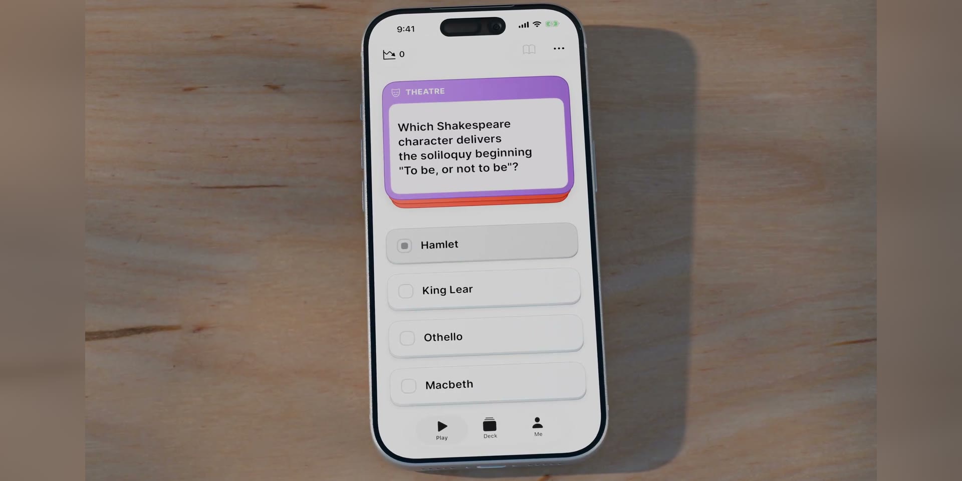
Trivia Shuffle is a native iOS general knowledge quiz, designed to feel like a well-made board game. One question at a time, five knowledge areas, no timer. The user picks an answer, confirms it, and the reveal shows the correct option, a short fact, and how other players answered. Difficulty adapts in the background.
It's designed primarily for older adults, an audience that grew up with pub quizzes and board games and is largely ignored by existing quiz apps. That audience set the constraints for everything else.

The problem
Most quiz apps target a younger player, with timers, streaks, and competitive pressure. This design aims for the opposite. It is calm, untimed, comfortable to read, and stays usable as vision and dexterity change with age.

Key design decisions
Designing for older adults first
Text is set large, touch targets sit well above Apple's Human Interface Guidelines minimum, colours stay distinguishable as colour vision changes with age, and nothing runs on a timer. A larger, closer target is surer to hit as motor precision declines, and the pacing and legibility choices follow established research on older users.
Designing for the harder case first tends to make an app better for everyone.

Tap to select, tap again to confirm
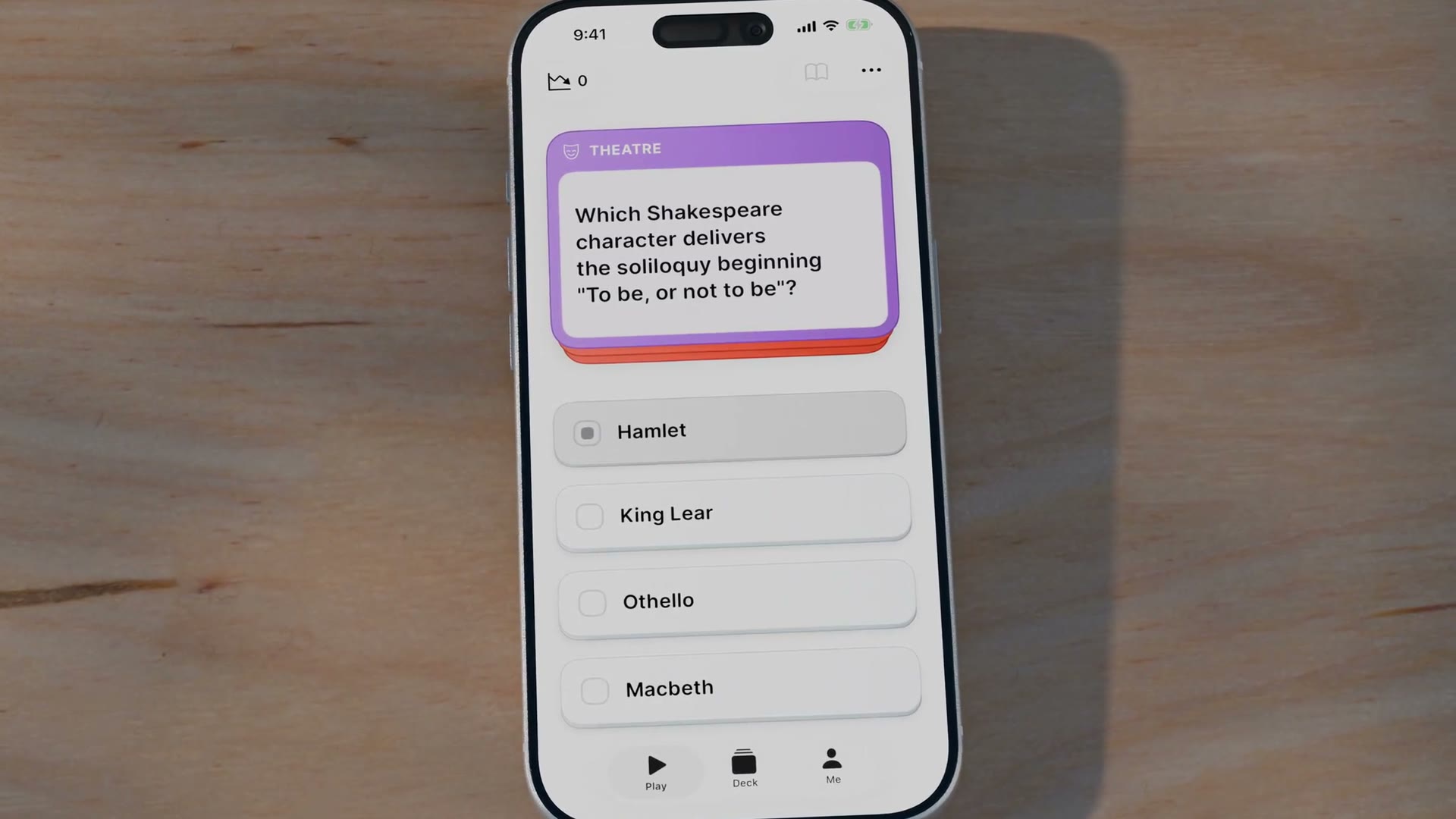
Answering takes two taps. The first arms a card, the second commits, and tapping a different card moves the selection. A mis-tap is a slip rather than a mistake, and the two-step gesture catches it before it costs a wrong answer.
Adaptive difficulty that stays hidden
A hidden rating system adjusts difficulty like a chess rating, so questions stay challenging without becoming discouraging. Showing the number would turn a calm game into a scoreboard.
Showing how others answered
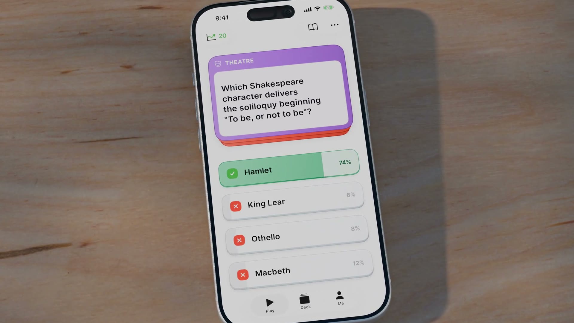
After committing, the reveal shows the correct answer and the share of players who picked each option. Missing a widely missed question feels less personal, and getting a hard one right feels earned.
The percentages are currently seeded with realistic per-question distributions, as the app has no user base yet.
Accessibility
An in-app control overrides the system text size, for people who never found the system setting. There is a high-contrast mode, a reduce-motion option that swaps movement for cross-fades, and a read-aloud mode that speaks questions and answers at a slower rate.
The core flow is labelled for VoiceOver, including the confirm mechanic. Contrast meets AA, with the high-contrast mode targeting AAA; a full WCAG audit and complete VoiceOver pass come before release.

Testing and iteration
Testing ran on device throughout the build. A timing guard now stops the commit tap from skipping the reveal screen. The percentage bars originally animated their width and looked unstable, so they became fixed slots that fade in. Answer text wraps instead of truncating, and the haptics for correct and wrong, identical at first, are now separate patterns. The app has not yet been tested with external users.
The armed state originally used the category's own colour. Science is green and Entertainment is red, the same colours the app uses for correct and wrong, so an armed answer could look like a result before it was submitted. The armed state now darkens the card to a neutral grey instead.

What's next
The next step is launching on the App Store and building a user base, whose answers replace the seeded percentages with real data. The app is free for now, and multiplayer was set aside so the single-player game could be right first.