Australia Illuminated
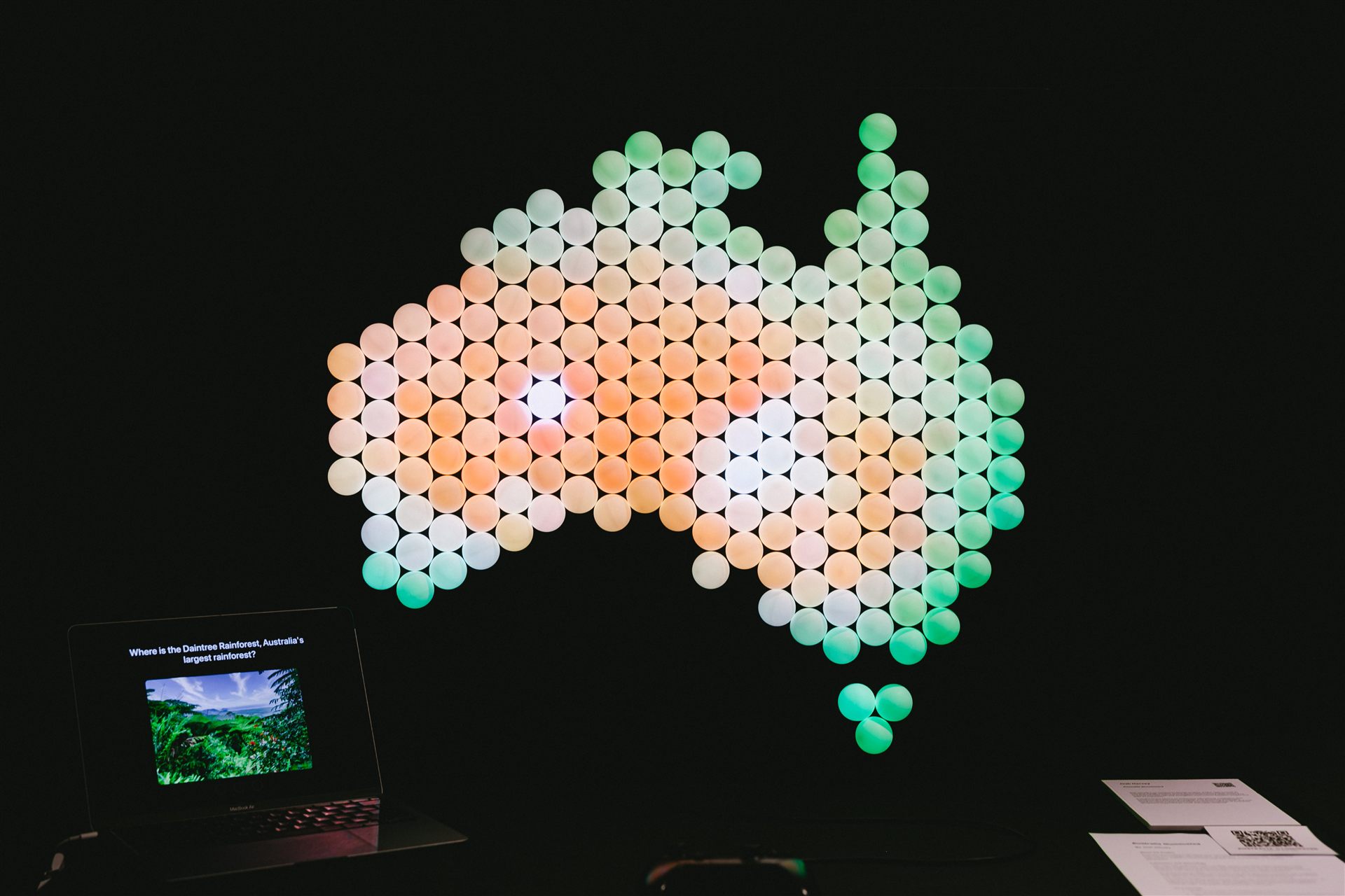
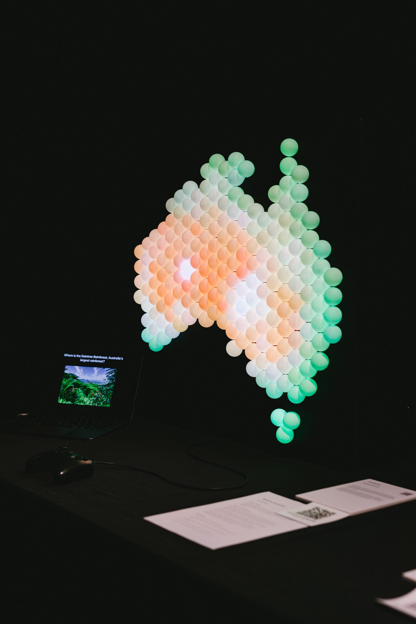
Australia Illuminated is a large, physical map of Australia built using 197 individually addressable LED cells, paired with a quiz on a screen. A question shows on the external screen, the user can then move a cursor across the map, and lock in their answer.
It's built for a museum or science centre context, where people walk up, play for a few minutes, and move on. A design for this context needed to be intuitive and require no external instruction.
The problem
Geography is spatial, but it often gets taught statically. The installation lets people learn where something is by seeing it there. A question is asked, then answered on the map itself.
The research supported this. Active, hands-on learning improves retention, and tangible interfaces make abstract information concrete. Answering on the map also uses natural mapping, where the control and what it controls share one layout.

Key design decisions
Diffused cells instead of a screen
Each of the 197 LEDs is capped with a ping pong ball that diffuses the light into an even glow. Bare LEDs appear as harsh points of light; diffused, the cells blend into regions of the map that are legible from across the room.

Colouring the map like a satellite image
The map is coloured like a satellite image, green along the coasts and dry orange through the centre. The colouring gives players a way to work answers out rather than rely on memory. Asked where the Daintree Rainforest is, someone who has never heard of it can still reason that a rainforest sits somewhere green, tropical, and probably coastal.
A familiar controller as the input
Input runs through a Nintendo Switch Pro Controller. An early prototype used keyboard arrow keys; preliminary testing prompted the switch to a handheld controller most visitors already know how to hold. Its vibration became a core feedback channel once audio was cut from the design.
Removing audio after it tested well
The original design had three feedback channels: light, sound, and touch. All three worked in quiet testing, but a mentor review identified that in a loud exhibition space an audio cue would be inaudible at the moment the result is shown. The audio was cut, and light and touch now confirm every answer on their own.

Designing a haptic vocabulary
With sound removed, one generic vibration was not enough, so each outcome has its own pulse pattern. The controller also gives a brief tick each time the cursor moves to a new cell, limited to ten per second so the pulses stay distinct.

Rewarding a perfect round
A perfect 3/3 score triggers a rainbow across the whole map and a celebration pulse in the controller, a deliberately larger payoff for finishing a game.

How it works
The question pool is 30 questions in three categories: states and territories, habitats, and landmarks. Each game asks three randomised questions; locking in an answer lights the relevant region green for correct or red for incorrect, with a matching vibration pulse in the controller.

The on-screen interface
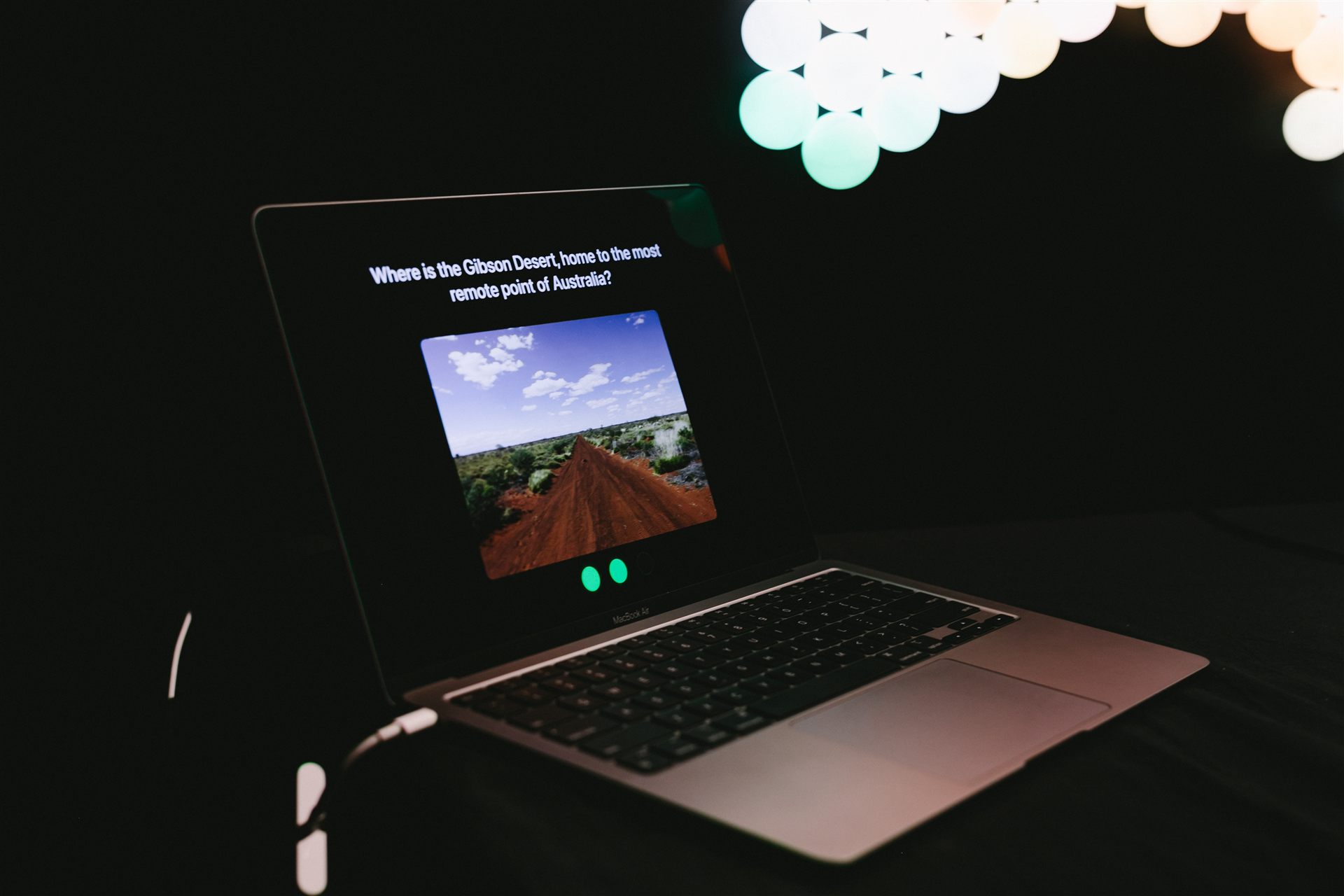
The screen interface has a start state, a question state, answer feedback, an information screen, and end states by score. Each question pairs an image with the prompt and a progress indicator, with type set large enough to read from a distance.
The fact about each answer only appears after the answer is committed, so it can't give the answer away.
Testing and what changed
Testing ran in rounds of increasing fidelity throughout the build.
Validating the questions before the build
A Wizard of Oz round ran with three participants. Questions were read aloud, answers were pointed to on a printed, numbered map, and correctness was called manually. This validated the question set and caught ambiguous wording and unfairly hard questions.

Think-aloud testing with the working prototype
Think-aloud sessions used the working prototype. Two participants each played about ten questions over five minutes while speaking their reasoning. Participants averaged about half of the questions correct, and wrong answers prompted curiosity rather than frustration. The sessions surfaced the usability problems below, each fixed before the exhibition.
Matching answer areas to the display's resolution
The display is large but low resolution, so a single cell cannot pin down a point like Uluru, and an answer one cell off would be marked wrong. The fix keeps two lists. The exact cell is the one that lights up, but that cell plus its six neighbours counts as correct, matching the judgement to what the display can resolve.

Giving players more than one attempt
Each question allows three attempts. A non-final wrong guess gives one medium pulse and another try; the third miss reveals the answer in red.
Adding a fact after each answer
After each answer, an information screen shows a second image and a short fact about the species or landmark, so the player leaves each question knowing something either way.
In use
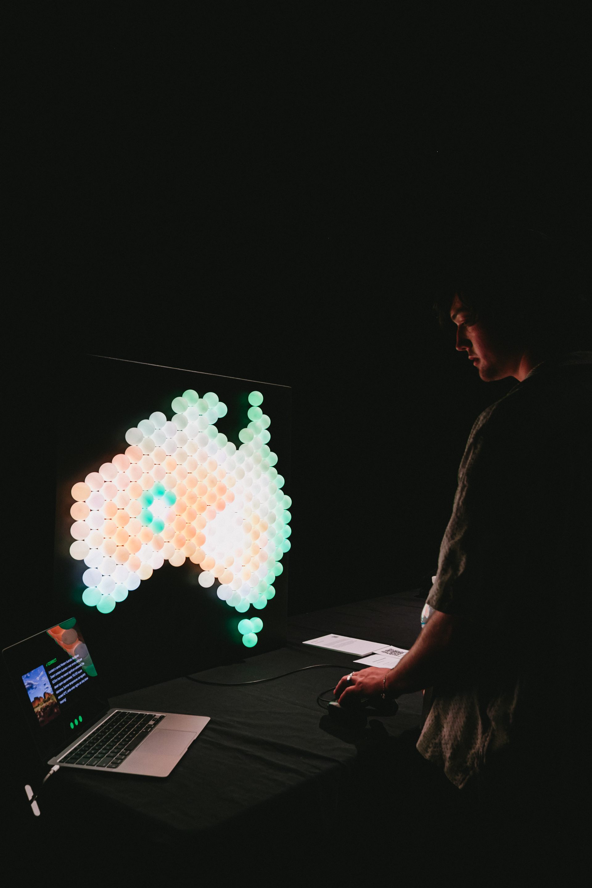
In a dim room the map is visible from across the floor. The design assumed a single player, but groups of two to five formed, pointing and debating answers while one person used the controller, an unplanned example of tangible interfaces supporting collaborative learning.
What I'd change
The group behaviour would shape the next version. Shared audio could serve onlookers, and the next build would be designed as a group experience from the start.
The input would also be revisited. A control surface built into the object, or pressable cells, would feel more native than a separate controller and would need to survive constant public use.