Trivia Shuffle
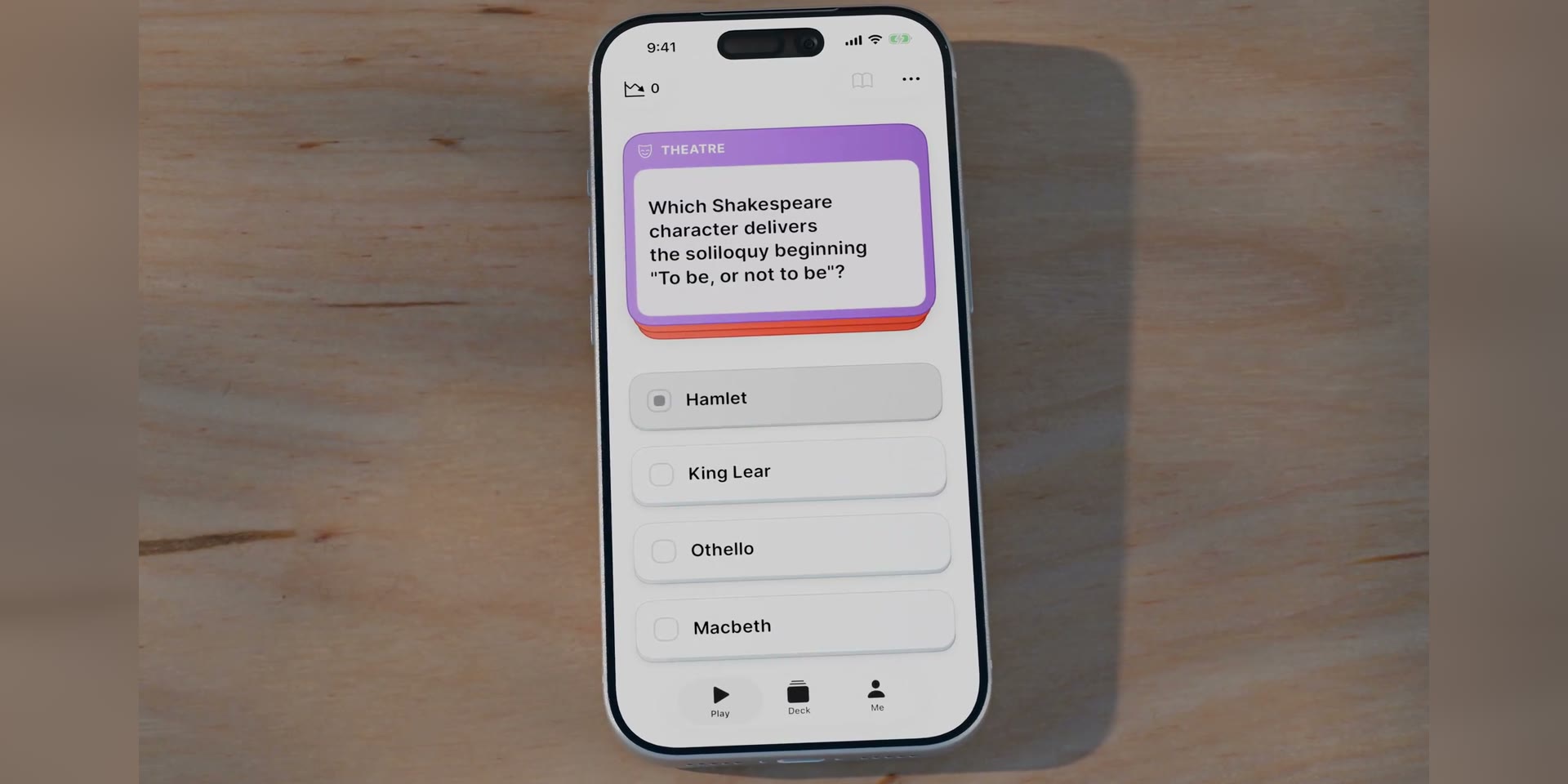
Trivia Shuffle is a general knowledge quiz for adults, built to feel like a well-made board game. One question at a time, five knowledge areas, no timer. The player picks an answer, confirms it, and the reveal shows the correct option, a short fact, and how other players answered. Difficulty adapts quietly as they play.
I designed it for adults 50 and over, an audience that grew up with pub quizzes and Trivial Pursuit and gets ignored by quiz apps built for teenagers. That one choice set the constraints for everything else, from the size of the text to the pace of the game.

The problem
Most quiz apps are built for a younger player and a different mood. They run on timers, streaks, and competitive pressure. For someone who enjoys general knowledge for its own sake, all of that works against the pleasure.
I wanted the opposite: calm, generous with time, comfortable to read, and worth playing because you come away knowing more. It also has to stay usable as vision and dexterity change with age.

Key design decisions
Designing for a 50 and over audience first
The audience is visible throughout the build. Text is set large, touch targets sit well above the standard minimum, colours are spaced to stay distinguishable as colour vision changes with age, and nothing runs on a timer.
The touch sizes follow Apple's Human Interface Guidelines, and the pacing and legibility choices draw on Nielsen Norman Group's research on older users. Designing for the harder case first tends to make an app better for everyone.

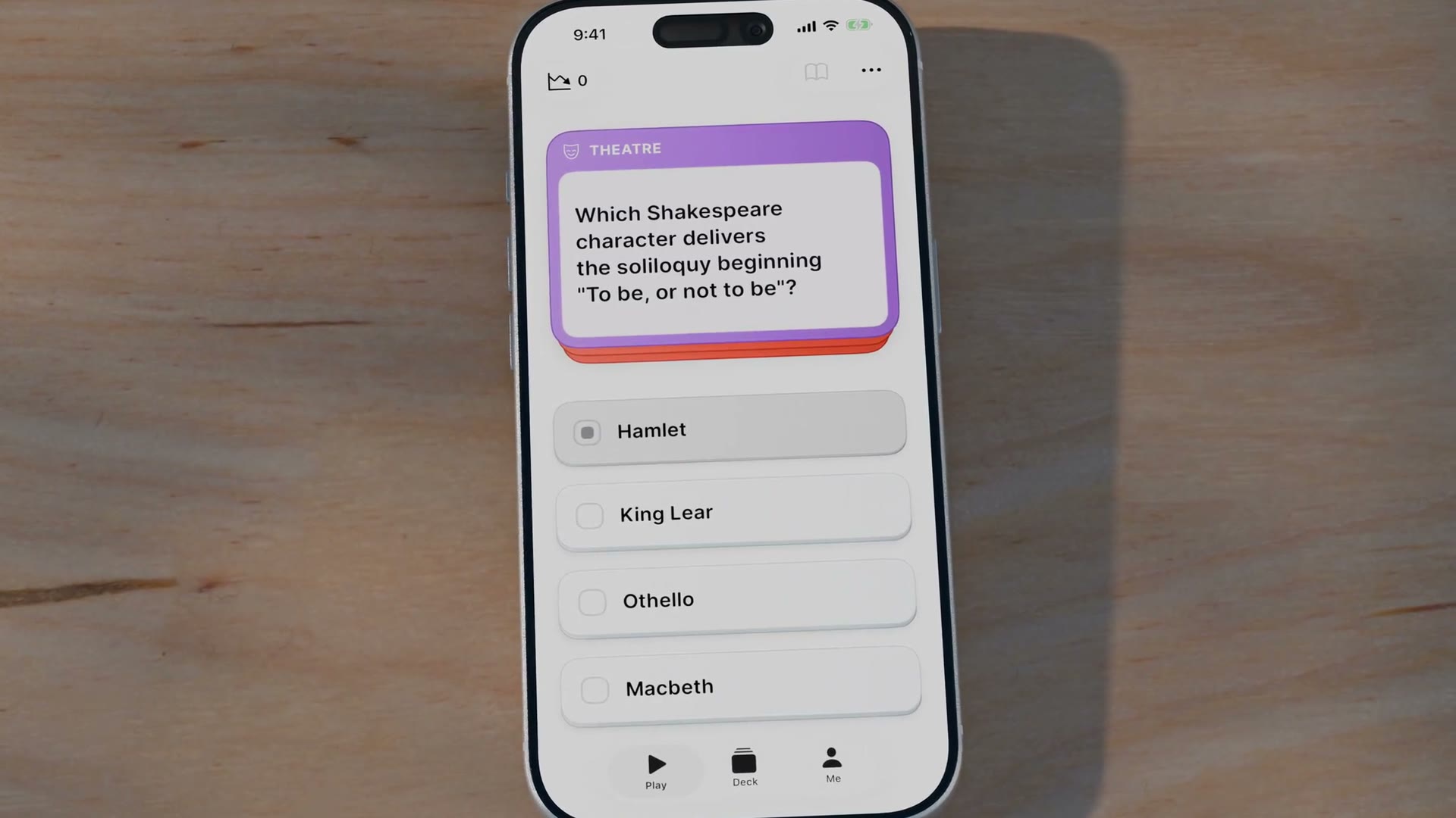
Tap to select, tap again to confirm
Answering takes two taps. The first arms a card, darkening it and filling a marker. The second tap on the same card commits, and tapping a different card just moves the selection.
There is no timer, so a mis-tap should never cost a wrong answer. Imprecise touches are more common with less steady hands, and the two-step gesture follows the same logic iOS uses to confirm actions that matter.
Adaptive difficulty that stays hidden
A rating system runs behind the questions, adjusting like a chess rating so difficulty stays challenging without becoming discouraging. The player never sees the number. They just notice the questions feel fair.
Showing the rating would turn a calm knowledge game into a scoreboard, and a score to defend is exactly the pressure the app is built to avoid.
Showing how others answered
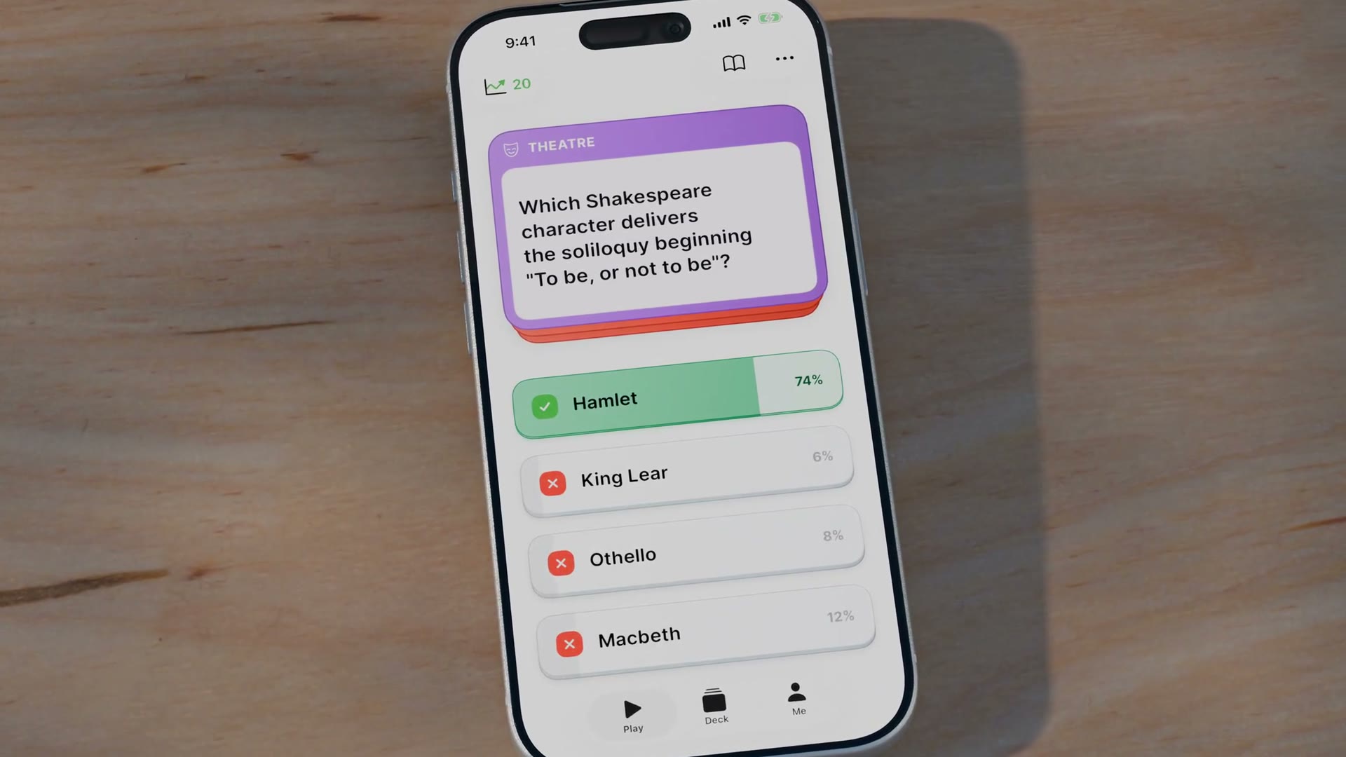
After the player commits, the reveal shows the correct answer and the share of players who picked each option. Missing a question most people missed feels less personal. Getting a hard one right, against a low percentage, feels earned.
Those percentages are currently seeded with realistic per-question distributions, because the app has no user base yet. The system is built to blend in real answers once players exist.
The spread also teaches quietly. An even split across four options means the question was genuinely hard. A lopsided one means it was easy. The reveal says something about the question, not just the player.
Making a screen feel like a physical object
The answer buttons are drawn as physical cards, with a raised face, a darker edge, and a press animation that moves like a real button. The reference is a Trivial Pursuit card: a coloured frame around a paper body.
A card like that is less plainly native than a flat iOS button, and it was a deliberate trade. For an audience raised on physical games, the tactile quality is a big part of why the app feels pleasant instead of sterile.

Accessibility
The player can override the system text size with an in-app control, for people who never found the system setting. There is a high-contrast mode, a reduce-motion option that swaps movement for cross-fades, and a read-aloud mode that speaks questions and answers at a slower rate. Layouts hold together as Dynamic Type grows.
The core flow is labelled for VoiceOver, including the confirm mechanic. Contrast follows Apple's system standards, which meet AA, and the high-contrast mode targets AAA. I spot-checked individual colour pairings rather than auditing all of them, so a full WCAG audit and a complete VoiceOver pass are the next steps before release.

Testing and iteration
I tested on device throughout the build, and it drove real changes, though the app has not yet been in front of external users.
Most fixes came from using it and finding what broke. The commit tap also triggered the advance-to-next handler, flashing the reveal for a single frame before skipping it; a timing guard fixed that. The percentage bars first animated their width and looked unstable, so they became fixed slots that fade in. Answer text truncated into ellipses, so the layout was rebuilt to wrap. The haptics felt late, and correct and wrong felt identical, so both were rebuilt as distinct pre-warmed patterns.
One fix was pure design reasoning. The armed state first used the category's own colour, but Science is green and Entertainment is red, the same colours the app uses for correct and wrong. A colour that reads as a verdict has no place on an uncommitted answer, so the armed state became a neutral darkening.

The next step is testing with real users: five to eight moderated sessions with adults in the target age range, each playing about ten questions with no guidance. I will be watching for mis-taps on the confirm step, whether the percentage reveal is understood, and whether the text sizes feel right in practice.
What's next
Beyond that testing round, monetisation and multiplayer are still open decisions.
The intended model is a one-time unlock. A calm app should not carry a subscription's ongoing pressure or advertising's interruptions, and the older audience is wary of both. Multiplayer was considered and set aside so the single-player game could be right first.
Today the app is a working, accessible single-player game with its core loop resolved. User testing, a formal accessibility audit, and monetisation come next.