Australia Illuminated
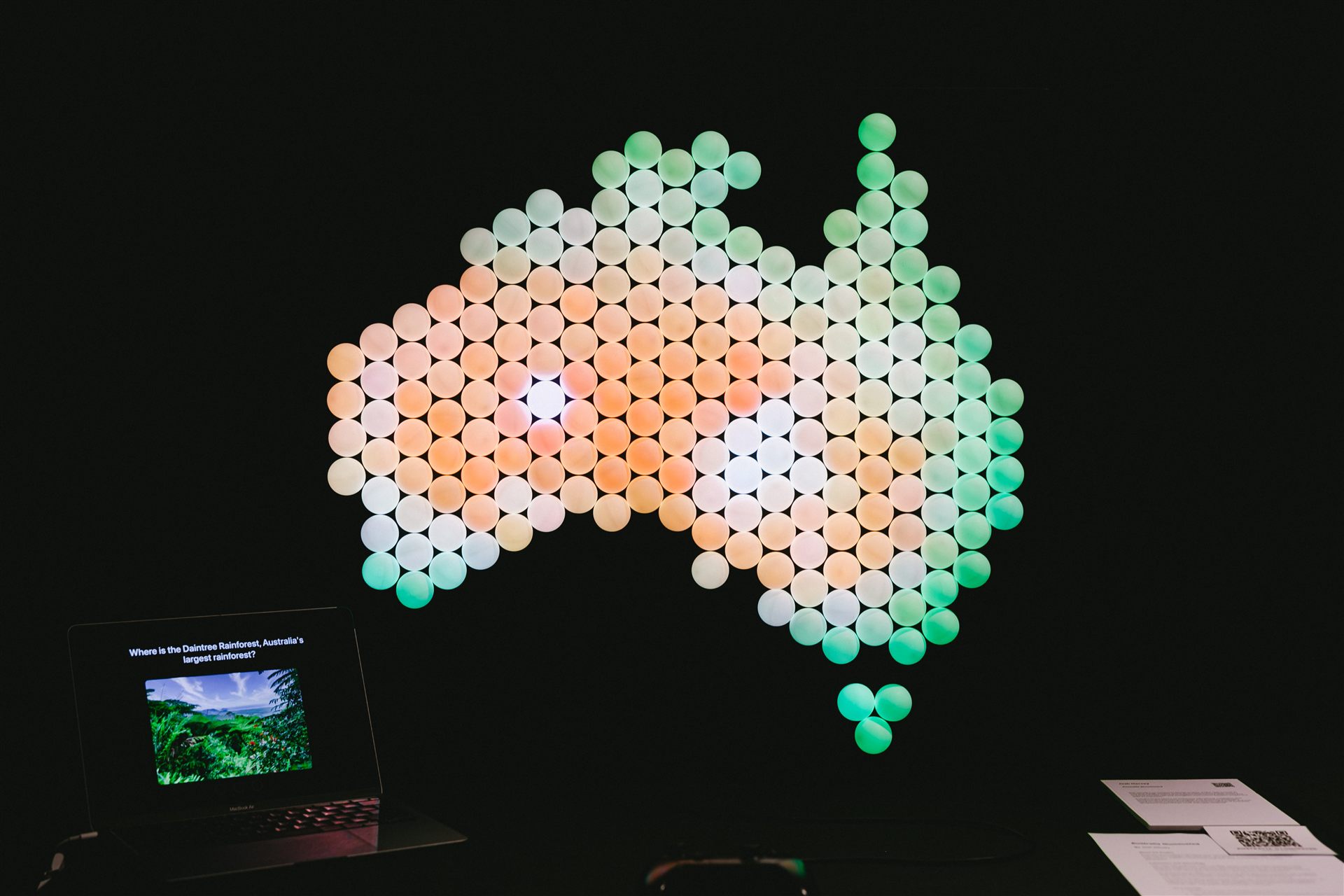
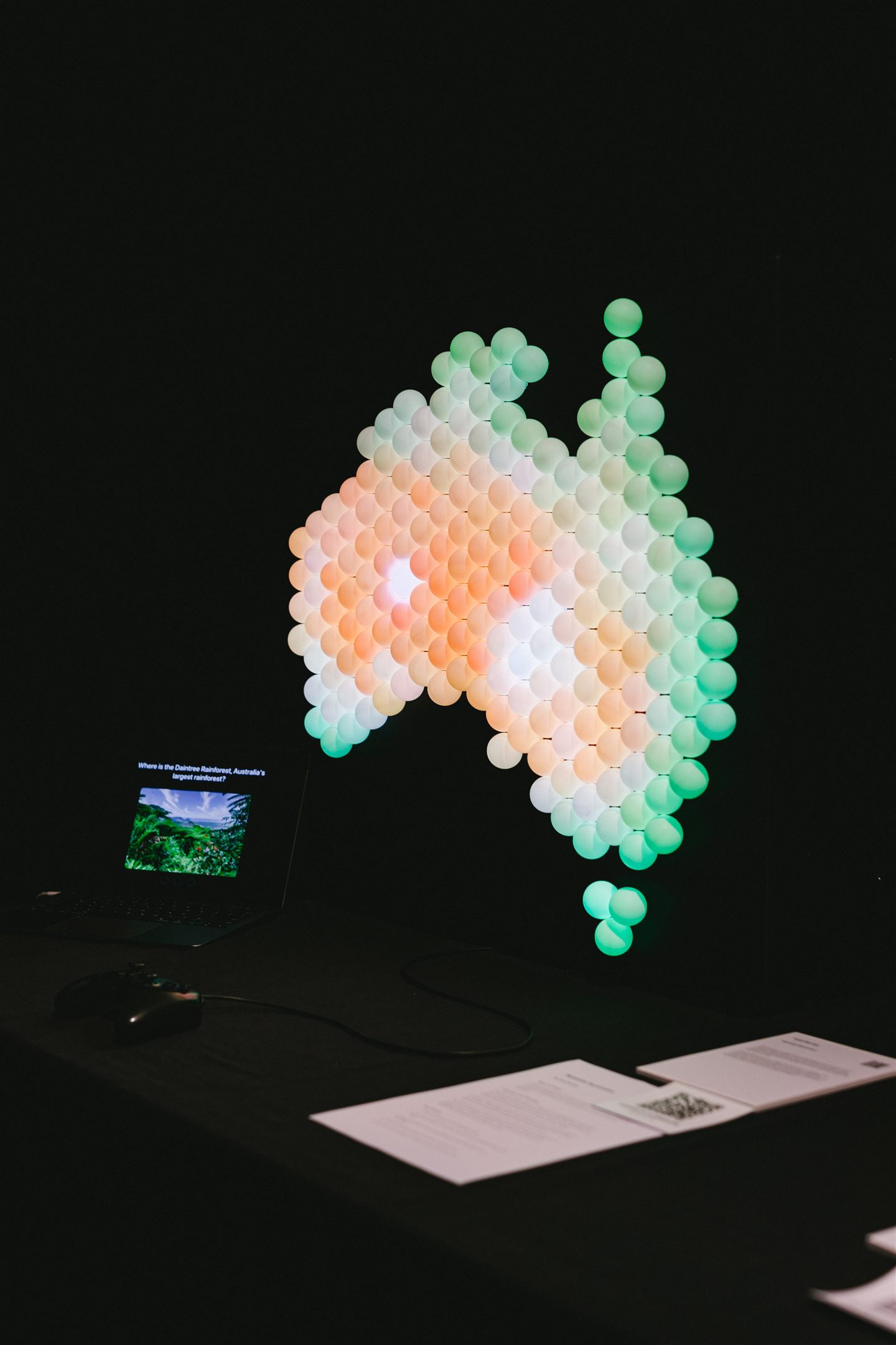
Australia Illuminated is a wall-mounted map of Australia built from 197 lit cells, paired with a quiz on a screen. A question appears, the player moves a cursor across the map with a game controller, and a locked-in answer lights the region green for right or red for wrong. The controller pulses in their hand at the same moment.
I built it for a public exhibition floor, where people walk up cold, play for a minute, and move on. Nobody reads instructions in that setting and nobody is there to explain. Every decision below comes back to that.
The problem
Geography is spatial, but it usually gets taught as text. You memorise that koalas live on the east coast, then try to attach that to a map later.
I wanted to close that gap and let people learn where something is by seeing it there. Ask the question, then answer it on the shape of the country itself.
The research supported the approach. Active, hands-on learning holds attention and improves retention, and tangible interfaces make abstract information more concrete. A glowing map sits right where those two findings overlap.

Key design decisions
Diffused cells instead of a screen
Each of the 197 LEDs is capped with a ping pong ball that softens the light into an even glow. An earlier sketch used physical pins the player would place on the map, but seeing how a diffused display read from across the room changed my mind. On a public floor, feedback has to be legible before anyone has even decided to play.
Raw LEDs are harsh points of light. Diffused, the cells merge into shapes the eye reads as regions of the map, so a passer-by can understand a result without being taught how to look at it.

A familiar controller as the input
Input runs through a standard game controller. Most people have held one before, so a stranger can move the cursor with no explanation, which is exactly what an unstaffed exhibit needs.
The controller can also vibrate, and the design came to depend on that channel once the exhibition floor ruled out sound.
Mostly, though, the input had to disappear. A visitor who spends their first thirty seconds working out how to answer never gets to the geography.
Removing audio after it tested well
The plan had three feedback channels: light, sound, and touch. In a quiet room all three worked. I cut the audio anyway.
A mentor pointed out what my testing had hidden. A real exhibition floor is loud, and an audio cue would be buried under the crowd at the exact moment a result needed to land.
Cutting it reset the brief for everything else. Light and touch now had to confirm every answer on their own.

Designing a haptic vocabulary
With touch doing work that sound used to share, one generic vibration was not enough. Each outcome feels different: a short double pulse for a correct answer, a single longer buzz for a wrong one, longer again when the guesses run out, and an end-of-game pattern that changes with the score. The player can tell what happened by feel alone.
Moving the cursor fires a tiny tick, throttled to one every tenth of a second at most. Constant vibration turns into noise the hand stops feeling, so the spacing is what keeps each tick readable. This is the part of the project I would show first.

Rewarding a perfect round
A 3/3 score triggers a rainbow that radiates out from the centre of the map while the controller plays a celebration pulse. It is deliberately bigger than the per-answer feedback. In a setting people can walk away from at any moment, finishing a game needs a payoff.

How it works
Three parts, none of which the player has to think about. The screen asks, the controller moves the cursor, and the map answers in light. Submit and the region flashes green or red while the controller gives the matching pulse. Then the next question loads.

The on-screen interface
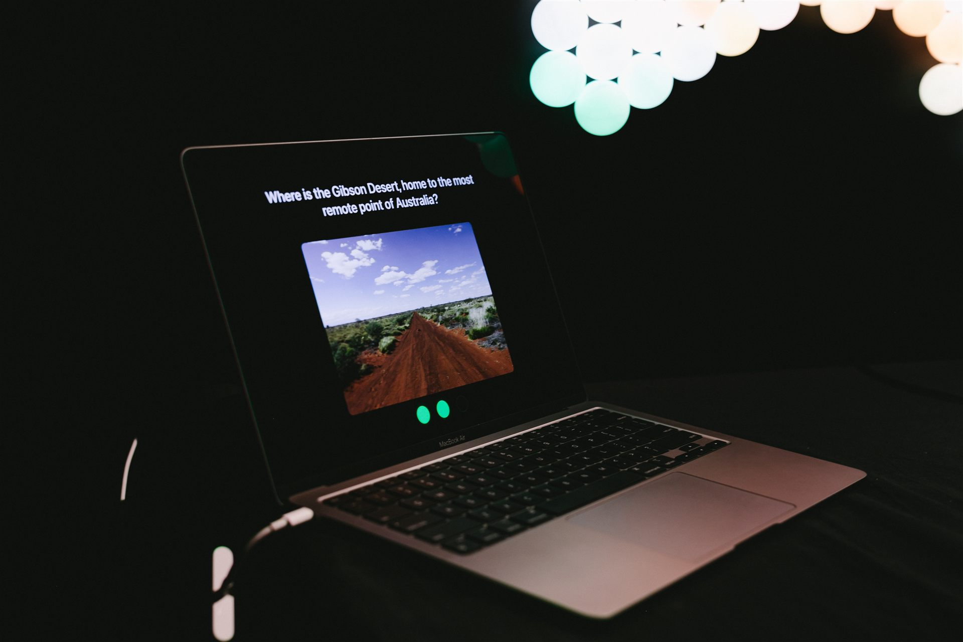
The screen side is a small product in itself: a start state, a question state, answer feedback, an information screen, and end states by score. Each question pairs an image with the prompt and a progress indicator, so the player always knows where they are in a game.
The type is set large. The screen sits a step or two back and the audience runs from children to older adults, so text has to hold up across that distance and that range. Each state has one focus: one thing to read, one thing to do.
The fact about each answer appears after the player commits, never before, because shown first it would give the answer away. And every result lands on two channels at once, colour on the map and a pulse in the hand, so the outcome reads even when the player is not looking at the lights.
Testing and what changed
Testing ran in rounds of rising fidelity and kept running through the build.
Validating the questions before the build
The first round had no prototype at all. I read each question aloud, participants pointed at a printed, numbered map, and I called out right or wrong by hand. A Wizard of Oz test like this answers the cheapest questions first: do the questions make sense, and does pointing at a map work?
It caught ambiguous wording and a few questions that were unfairly hard. Both were fixed before a line of quiz code existed.

Think-aloud testing with the working prototype
Once the prototype worked, participants played while saying their thinking out loud. These sessions ran in short cycles through the build, so each change was checked against real use instead of assumed to work.
The strongest signal was emotional. A wrong answer made people lean in rather than switch off, and several asked to keep playing. The sessions also surfaced three real problems, and each fix went back in front of players before the exhibition.
Matching answer areas to the display's resolution
The display is physically large but low resolution. A single cell cannot pin down a point like Uluru, so a player could know exactly where it is, sit one cell off, and be marked wrong. The system was punishing them for a limit of the display.
The fix keeps two lists. The exact answer cell is the one that lights up, so the display stays precise. That cell plus its six physical neighbours is what counts as correct, so the judgement matches what the display can actually resolve.

Giving players more than one attempt
A single pass-fail verdict cut the learning moment short, so each question now allows three attempts. A wrong-but-not-final guess gives one medium pulse and another try. Only the third miss reveals the answer in red with the longer buzz, so the player can feel the difference without reading anything.
Adding a fact after each answer
The quiz tested recognition, but the goal was learning. So after each answer, an information screen shows a second image and a short fact about the species or landmark. The player leaves each question knowing something, whether or not they got it right.
In use
The map drew people in and held them. In a dim room the glow reads from across the floor, and the scale of the piece holds a crowd.
I designed for a single player and got groups of two to five. People pointed at the map and argued about answers while one person drove the cursor. The research had said tangible interfaces support collaborative learning. I had not planned for it, and it happened anyway.
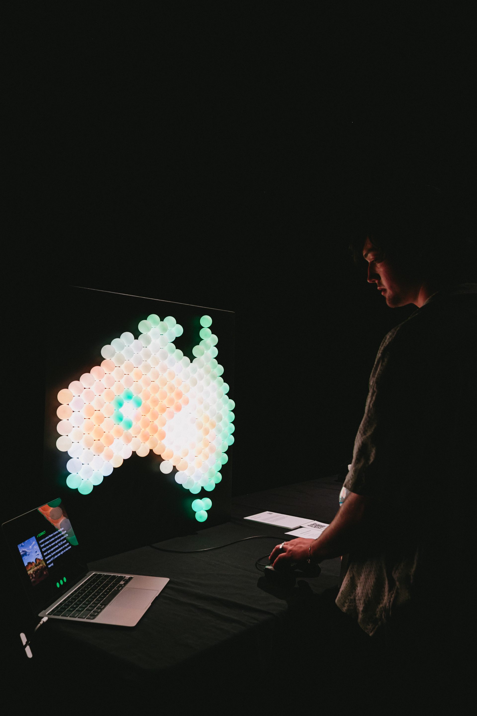
Players jumped up and celebrated when they scored 3/3 and the rainbow fired. Nobody prompted that. It came from strangers, in the room the project was built for, and it is the clearest sign the reward worked.
What I'd change
The group behaviour would shape the next version. I cut audio because a lone player on a loud floor would lose it, and that was right for the design I started with. But clusters of people leaning in together are a different acoustic situation, and shared audio could serve the onlookers who are engaged but not holding the controller. The next build would be a group experience from the start.
If this became a real product I would also revisit the input. A control surface built into the object, or pressable cells, would feel more native than a separate controller. Either would have to survive constant public use.
The lesson I keep coming back to is that designing for the room is not the same as designing for the test. The audio worked until I pictured a real floor. The answer areas were technically correct until I watched someone get marked wrong for knowing the answer. And the game was single-player until five people showed up to play it together.